Friends of SaTH
The Friends of The Shrewsbury and Telford Hospital (Friends of SaTH) is a charity that has been raising money and providing life-saving and life-changing equipment and support for local hospital services since 1966.
The brief
Source was challenged to create a stand-out creative approach to bring The Friends’ new brand to life in a way that was impactful – getting attention at every touchpoint, whilst retaining the brand values that make the charity so different from the others.
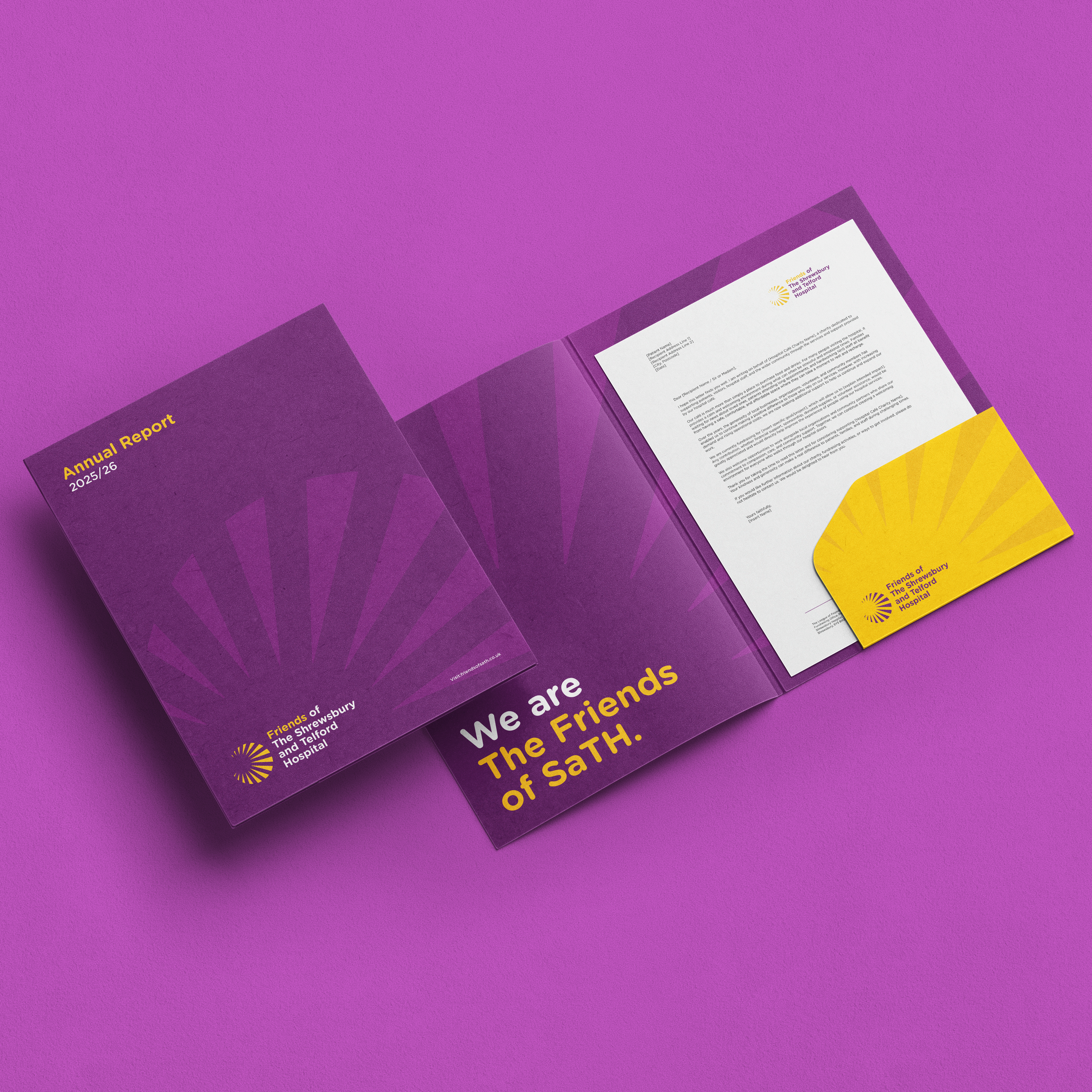
The specific requirements of the project were: creative direction to support the charity’s 60th Anniversary, including the rollout of key collateral across 2026 and into the future.
Background
The charity was previously known as The League of Friends of Royal Shrewsbury Hospital and focused solely on raising money for the main district hospital in Shrewsbury. However, it recently took over fundraising across both of the county’s main district hospitals in Shrewsbury and Telford, and changed its name to reflect this. To consolidate this change, the charity also commissioned the creation of a new brand logo and visual identity.
Source was brought on board to help bring the new brand to life, to support the 60th anniversary of the charity and to support reinvigorated, ongoing fundraising efforts.
About the charity market across Shropshire and the West Midlands
43% of all UK public donations in 2024 were made to health or medical charities, so it’s clear that people hold these charities close to their hearts. The Friends of SaTH has also developed a strong reputation for volunteer-led support, running hospital shops and always being there to offer a kind word or help to patients and their families. However, in the face of rising costs, a reduction in government support and an overall reduction in donations from the public, the competition between local and regional charities for donations from people and businesses has become more obvious. So, the need for the Friends to step up its brand awareness and to consolidate its fundraising activities was vital.
Solution
There was something inherently strong in the words ‘The Friends’ that simply couldn’t be ignored.
Other charities have donors, fundraisers or supporters – The Friends of SaTH have ‘friends’. There was so much power in this single word that this was not just an obvious choice for a creative direction, but a clever way to develop something that people, communities and businesses can gather around, support and feel a real sense of belonging to. Anyone who wanted to support the charity was doing so in a familiar, friendly way – they were friends – rather than just generic ‘donors’.
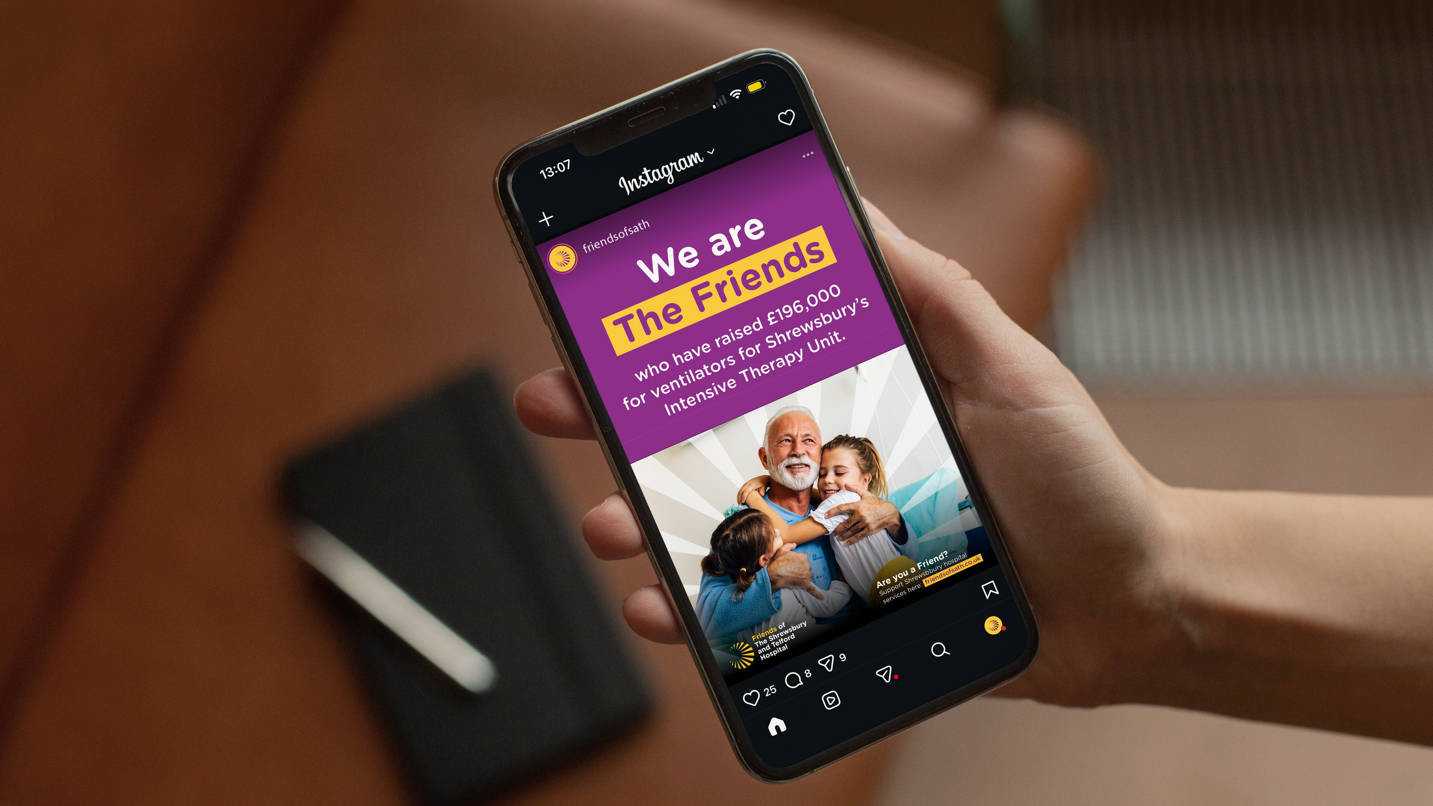
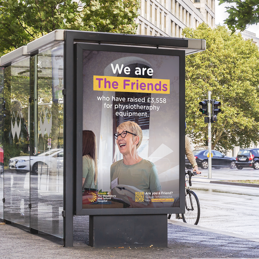
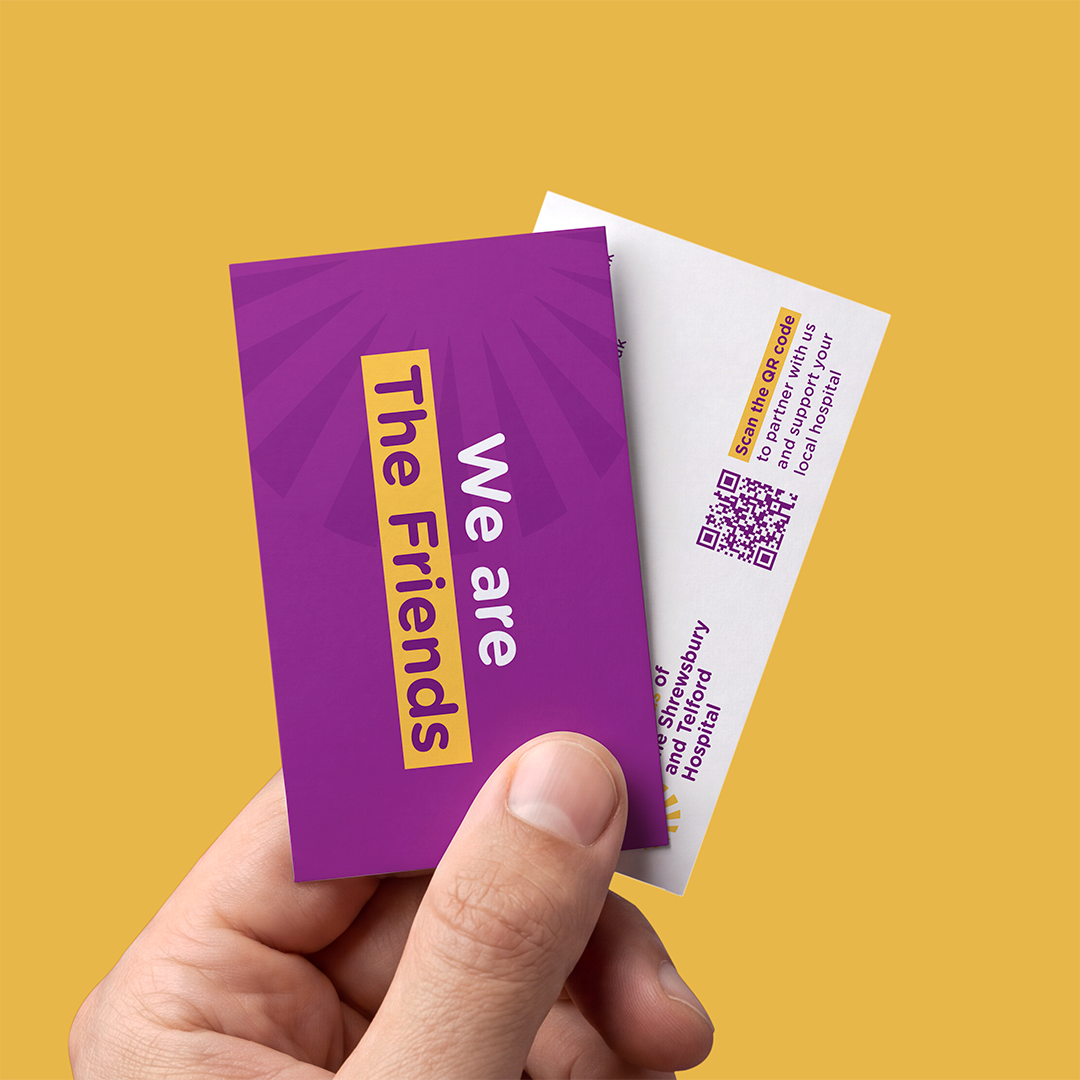
The tagline ‘We are the Friends’ has become a powerful and emotional call to action that is starting to be rolled out across all the charity’s marketing collateral. As well as a strong campaign lead, the proposition has also become an empathetic and caring sign-off for other materials.
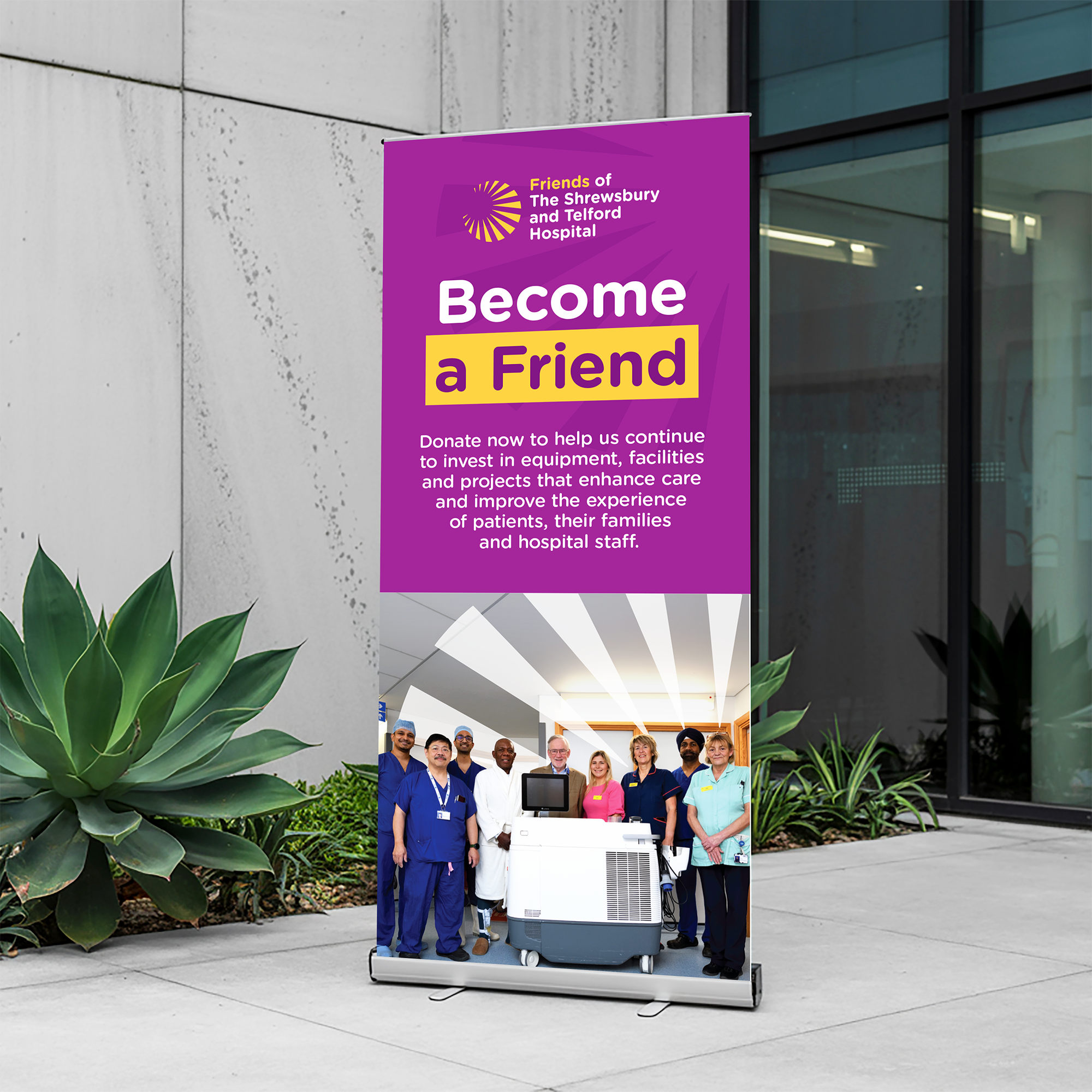
This creative approach, alongside the new brand identity, has also guided the visual development of the marketing materials and set the tone for photography. There is a strong juxtaposition between the new brand identity and the ‘We are the Friends’ creative direction, which creates a standout approach. Once seen, never forgotten. More importantly, it takes the charity in a different direction compared to other local charities.
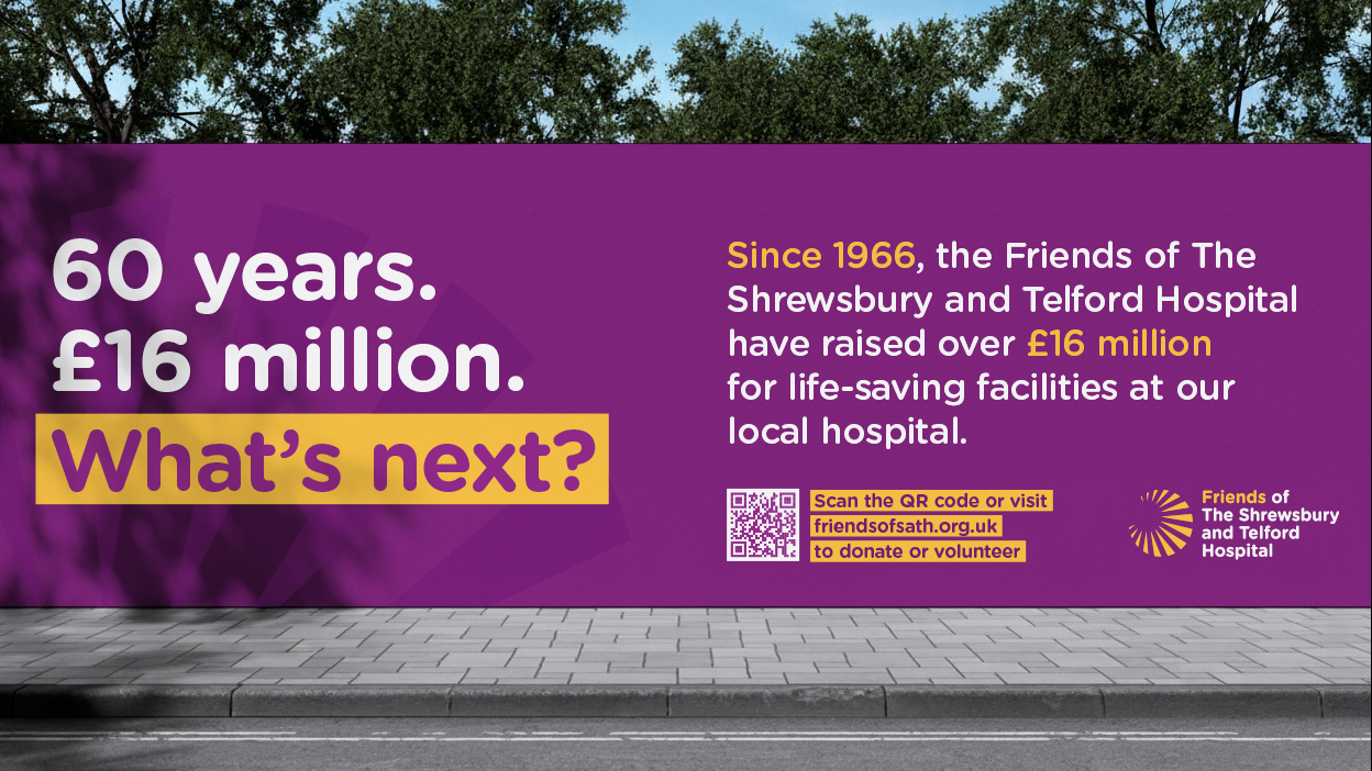
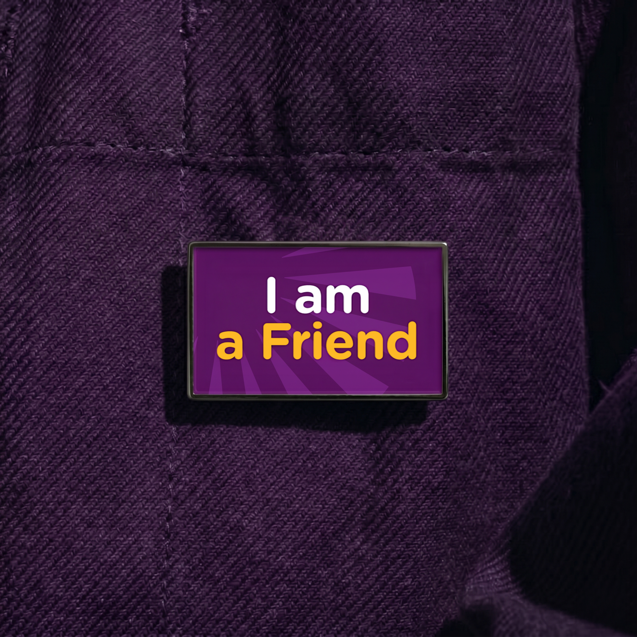
The charity has already invested in some key marketing collateral which takes the essence of the ‘We are the Friends’ approach and brings it to life. Such as pin badges that ‘friends’ can buy to support the charity, bike shelter wraps for on-site locations at the hospital and large-scale hoarding boards that are currently at the location of a new hospital development site. We can’t wait to see the campaign roll out even further as we get deeper into the fundraising activities of the Friends.